Refine Displayed Results with Chart Options [v5]
Whenever you run a query and get results, you are presented with chart options at the top of the results pane. The chart options are separated into three sections:
Display options.
Format options.
Additional options specific to the chart type, app, or view.
Use combinations of these options to create a variety of visualizations.
This article describes a few basic tasks:
Hide a measure: Use a chart option to hide and then redisplay an entire measure.
Stack bar charts: Group the results in Bar View displays with the Stacked by chart option.
Display values on top of each bar: Show the values on top of each bar. Stacked bars show the sum of all values for the bar.
Hide a line of results in Time View: Toggle a line of results in Time View on and off.
See the Adjust display options section in Analyze a distribution for information about chart options in the Distribution app.
Hide a measure
There might be times when you want to focus on results that don't include a measure, without having to create a new query. You can hide a measure with a chart option, then redisplay the measure.
This section shows you how to create and run a query with multiple measures, then hide individual measures to further analyze the data.
To hide a measure, do the following:
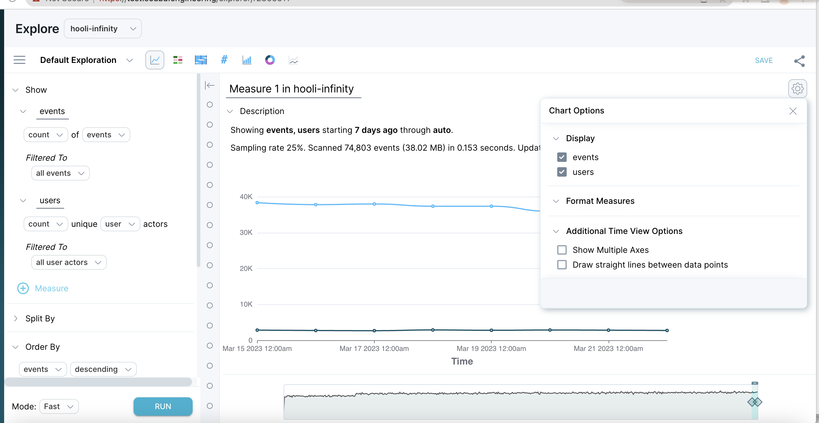
In Explore, create and run a query with multiple measures. For example, create a query with a measure of the count of events and a measure of the count of users.
Select Chart Options in the top right corner.
Click a measure check box to deselect, then click Apply. The results change to show only the selected measures.

Stack bar charts
You can refactor Bar View display results, grouping items together with the Stacked by option, without having to create a new query. Use a chart option to group bar chart results, and then redisplay the original results with equal ease.
To stack bar chart results, do the following:
In Explore, create and run a query with multiple measures. For example, create a query with a measure of the count of events and a measure of the count of users
In the top right corner of the query results window, click Chart Options.
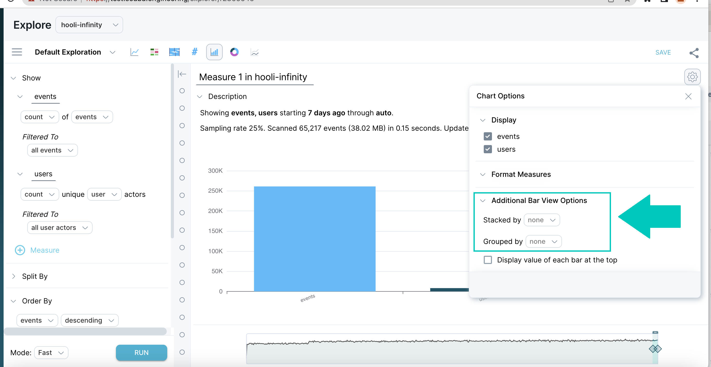
Scroll to the Additional Bar View Options section of the window.
Next to Stacked by, select none and choose an option to stack by from the drop-down list. In our example, we chose to stack the results by measure.
Click Apply. We received the following results in our example.
Optional: Make another Stacked by selection to regroup the results, or select none to return to the original display, then click Apply.

Display values on top of each bar
You can show and hide values on top of each bar in Bar View. For stacked bars, the sum of all values stacked on the bar is shown.
To show values on top of each bar, do the following:
Create and run a query, and display it in Bar View.
In the top right corner of the query results window, click Chart Options.
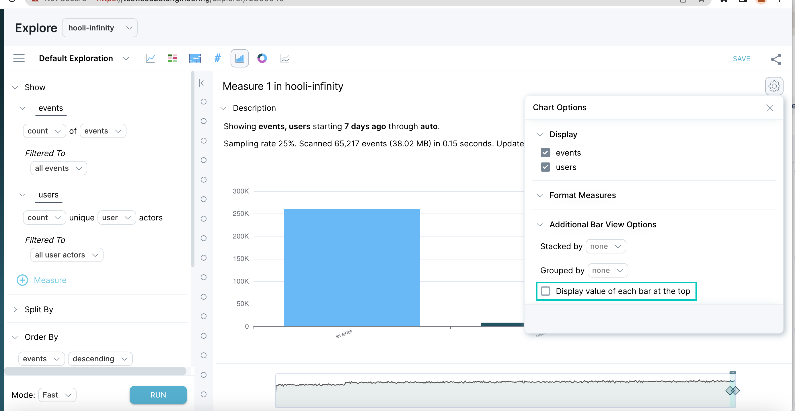
Click the Display value of each bar at the top check box, and then click Apply. Values are displayed at the top of each bar in Bar View, as shown in the following example. In a stacked bar chart, the number displayed at the top of each bar is the sum of all values in that bar.

Hide a line of results in Time View
When viewing query results in Time View, you might want to hide a single line that skews the results.
To hide a line of results in Time View, do the following:
In Explore, create and run a query split by an event property. For example, count of events split by device type.
In the legend on the right, select the line of results you want to hide. The line is highlighted in the graph display.
Click on the value of the line you want to hide or restore. The graph display adjusts accordingly.
